Infrastructure and Systems
View
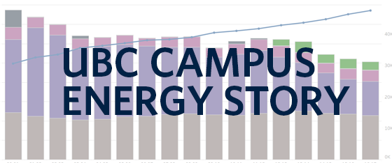
Campus Energy Visualization Map
Did you find what you were looking for?
Thanks for your response! If you'd like to share further feedback, please take our survey.
Didn’t find what you were looking for? We’d like to hear from you! Share your thoughts by taking our survey.

